Company
Invitae
Role
Modernizing the
Test Ordering Experience
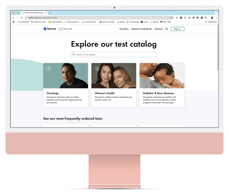
The Test Catalog Modernization initiative aims to simplify the ordering process, enhance usability, and upgrade the infrastructure to enable easier content management—all while delivering a seamless and efficient experience for healthcare providers.
“It took me 17 clicks to get the right tests and add-on combination to order for my patients!”
— Gregory, Oncologist
The Challenge
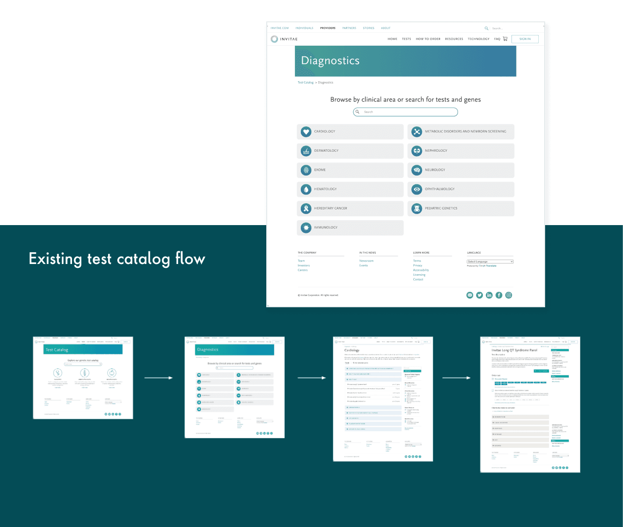
Invitae’s test catalog has grown significantly over the years, aiming to become a “one-stop shop” for all genetic testing needs. However, the user experience has lagged behind. The catalog is not intuitive—it's difficult to navigate, with tests divided into sections that are confusing for providers. It also takes too many clicks to add tests to the cart, making the ordering process inefficient and frustrating.
As a result, the catalog doesn’t support the needs of busy healthcare providers, who should be able to focus on patient care—not on figuring out how to order a test. The Test Catalog Modernization program focuses on improving usability and streamlining the test selection process, while also updating the underlying infrastructure to support easier content updates without requiring developer support.
Pain Points
How Might We
How might we create a test catalog experience that is clear, intuitive, and efficient—so providers can quickly find what they need, confidently place orders, and we can easily grow and update our offerings over time?
Research & Discovery
Simplified Test Categories
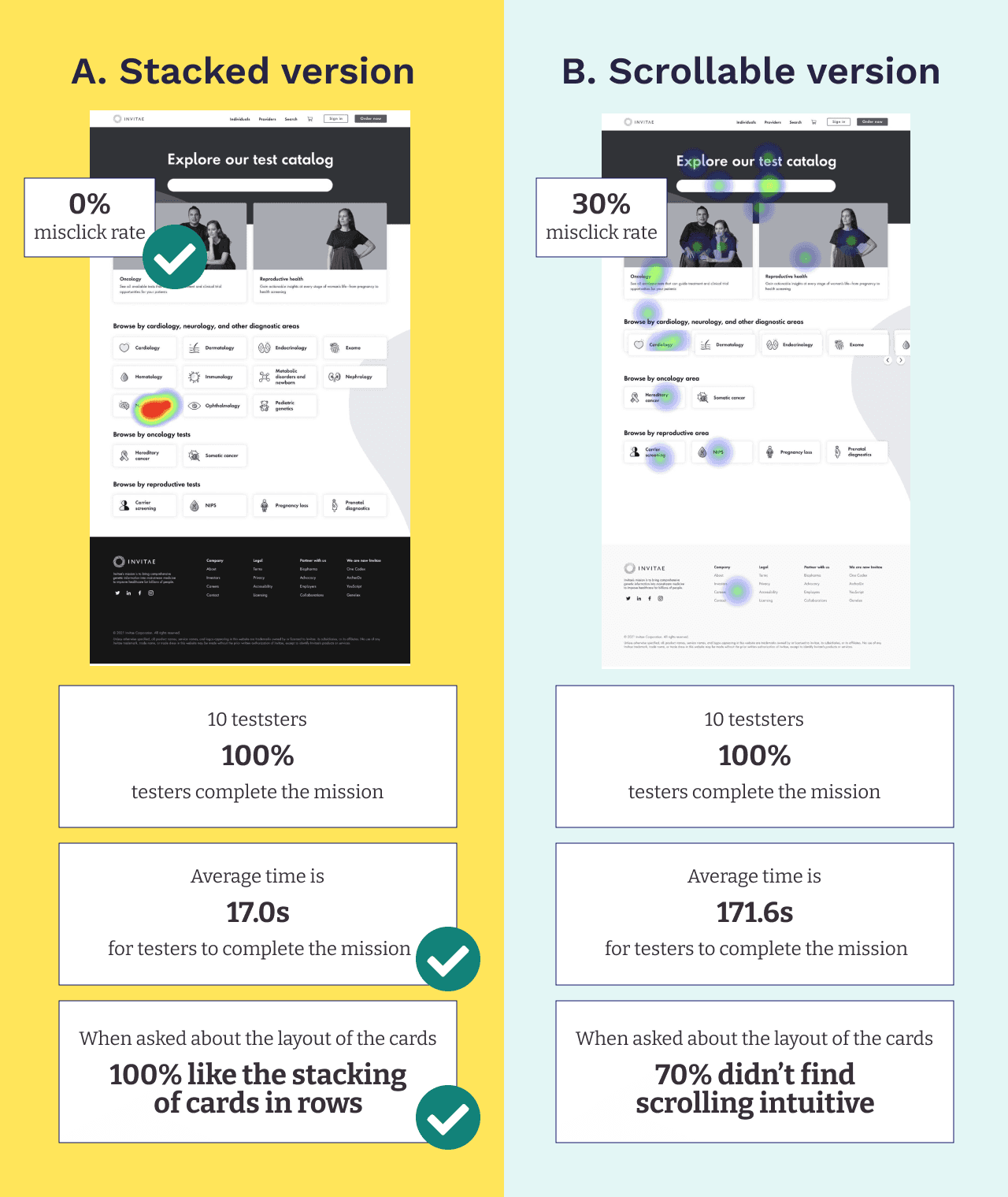
We restructured the test offerings into intuitive groups using plain language, avoiding medical jargon to better support a broad range of users.Improved Browsing Experience
Removed accordion subcategories based on user feedback, making all test options visible at a glance to reduce friction.Streamlined Navigation
Created multiple entry points and clear paths to help users quickly find and access the tests they need.
My focus
As the supporting designer on this project, I collaborated closely with the lead product designer, product managers, developers, and a data analyst. My key contributions included redesigning the test catalog homepage, conducting usability testing on our design explorations, and helping refine the overall user experience.
In parallel, I co-led the CMS (content management system) effort, where I focused on creating reusable components that could be implemented across the website. This work helped ensure consistency, scalability, and efficiency for future content updates.
Learnings & Iterations
Delayed Sprint Delivery
We experienced a slight delay by two sprints as the key clinical pages (Oncology and Reproductive Health) weren’t ready to launch with the rest of the experience. This was due to unexpected backend issues that surfaced during implementation, which the dev team needed time to resolve.
Although the business and marketing teams were eager to launch, I worked with the lead product designer to have an open discussion with stakeholders. We emphasized that launching an incomplete experience could hurt the customer journey and undermine the effort we had put into this project. With alignment across teams, we agreed it was worth doing it right.
Adjusted Launch Strategy
To reduce risk and ensure a seamless experience, we decided to delay the hub launch until the key clinical areas—Oncology and Reproductive Health—were also ready.
Phased Rollout
Phase 1 of the launch ultimately included the new test catalog hub, along with the Oncology and Reproductive Health sections, resulting in a more cohesive and user-centered release.
Metrics & Wins
11.1% of visitors added a test to their cart — up from a 3.1% baseline
4.5% completed an order from the 11.1% who added to cart
5x increase in conversion from viewing to cart in Oncology tests: 5.1% → 27.0%
2x increase in conversion for Reproductive tests: 4.6% → 9.2%
$92,299 in incremental weekly revenue
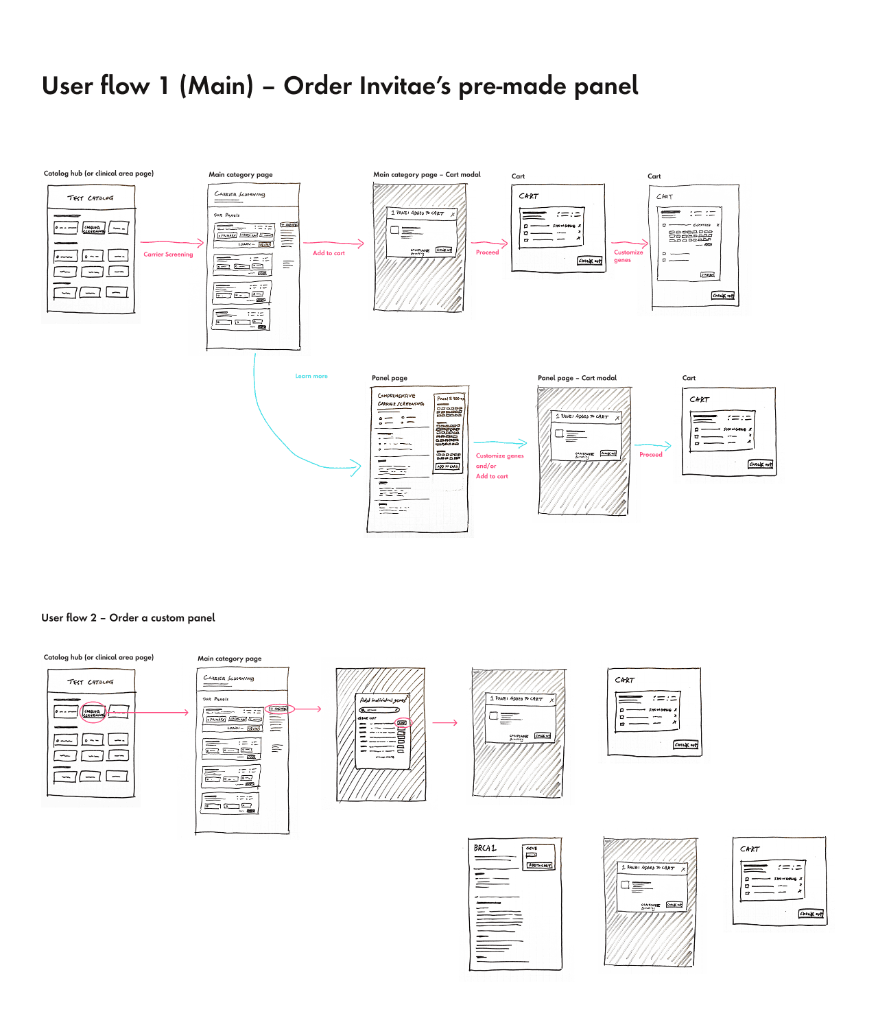
3 clicks to add a test to cart (down from many more previously)
Impact
After Phase 1 launch, the add-to-cart rate increased by 72%.
The new design was released incrementally focused on the key metrics: Add-to-Cart rate and Order completion rate. Now we have a baseline to continue to improve both, which supports the user and grows the business.