Company
Invitae
Role
Lead Product Designer
Icon Library
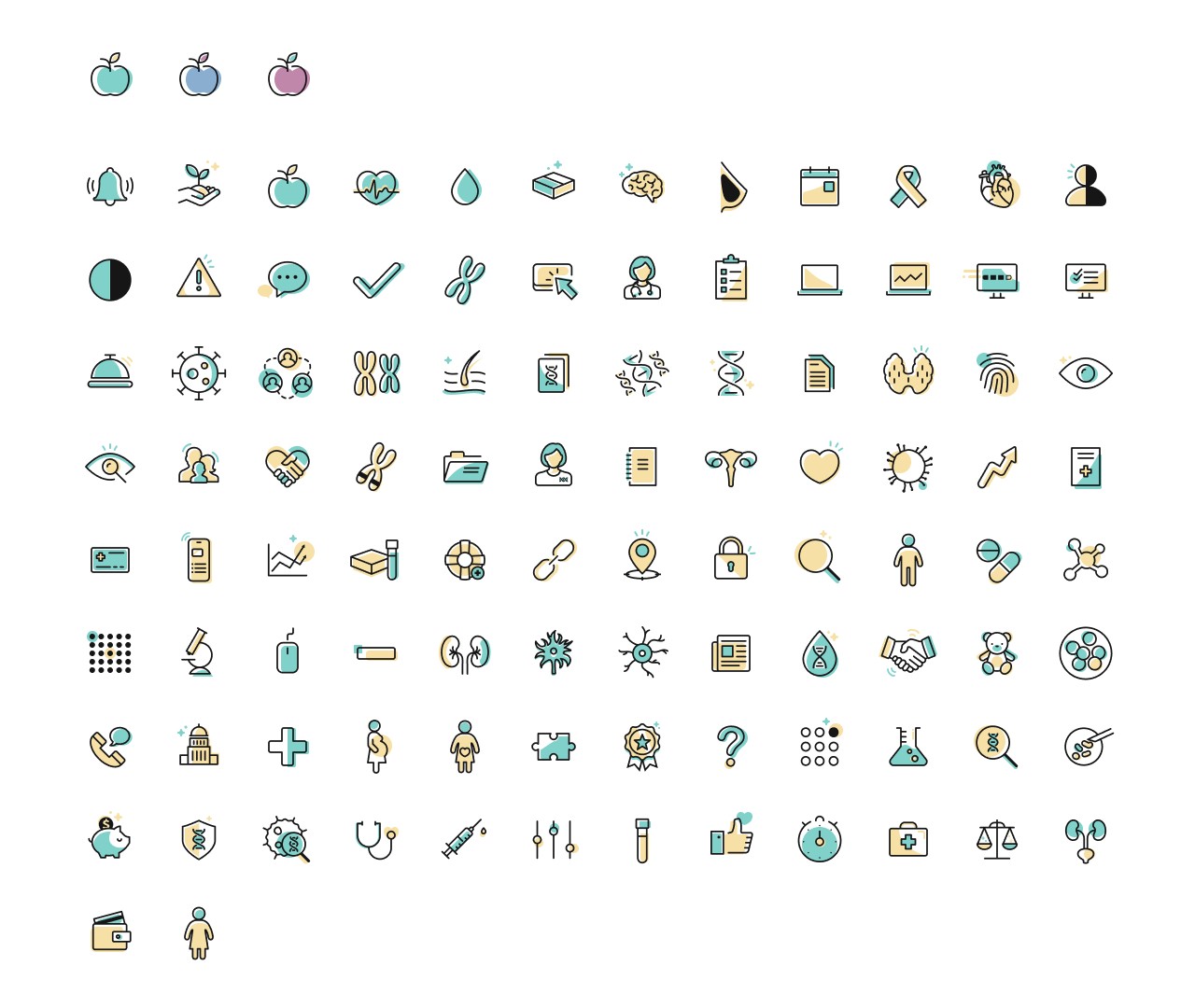
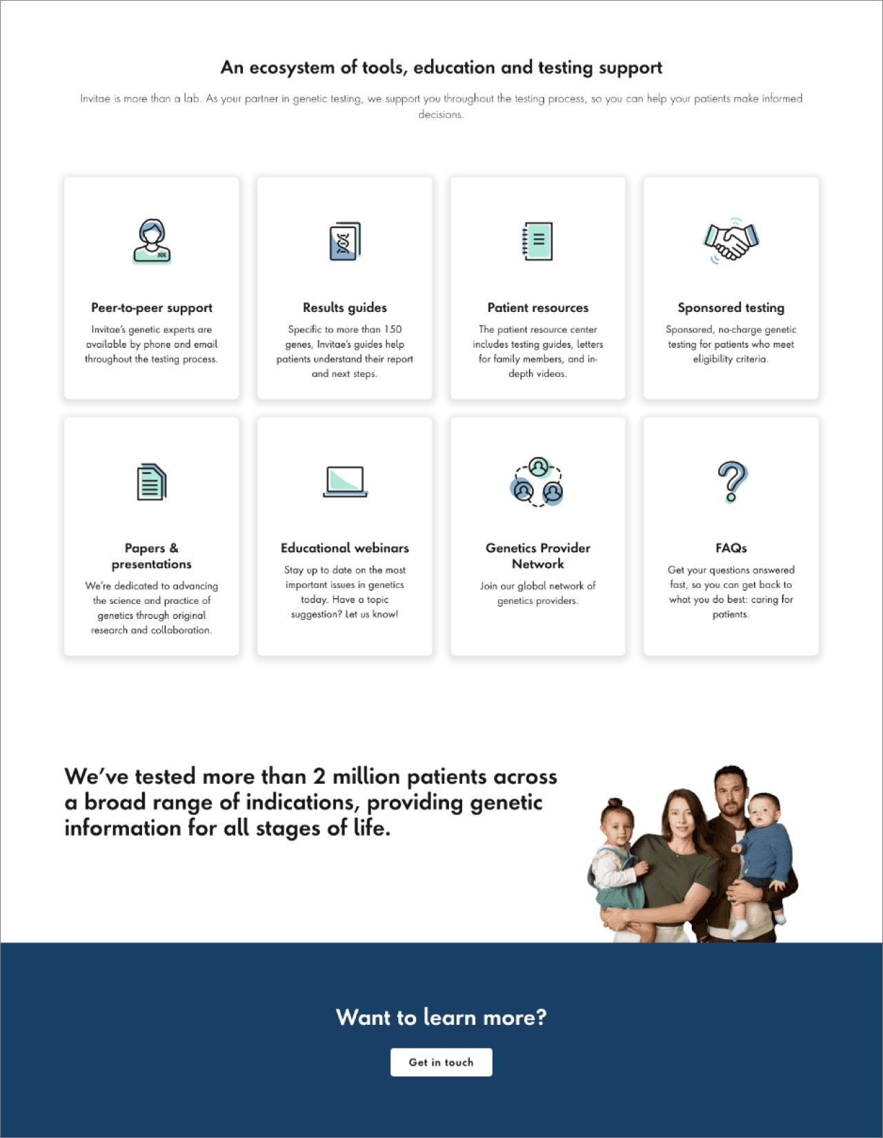
By designing a modern, cohesive set of icons, the company gained a consistent visual identity across its digital platforms. The new icons clearly represent the diseases, specialties, tests, and processes offered by the company, enhancing both usability and brand recognition.
The Challenge
As the start-up company expanded its services and offerings, it became clear that the branding needed a stronger, more consistent visual identity. There were too many inconsistencies in icon usage, primarily due to a mix of third-party libraries and contractor-created icons. The goal was to establish a clear hierarchy for proper icon usage and to modernize the icon set with consistent styles across the website and internal portals.
Process
Audit
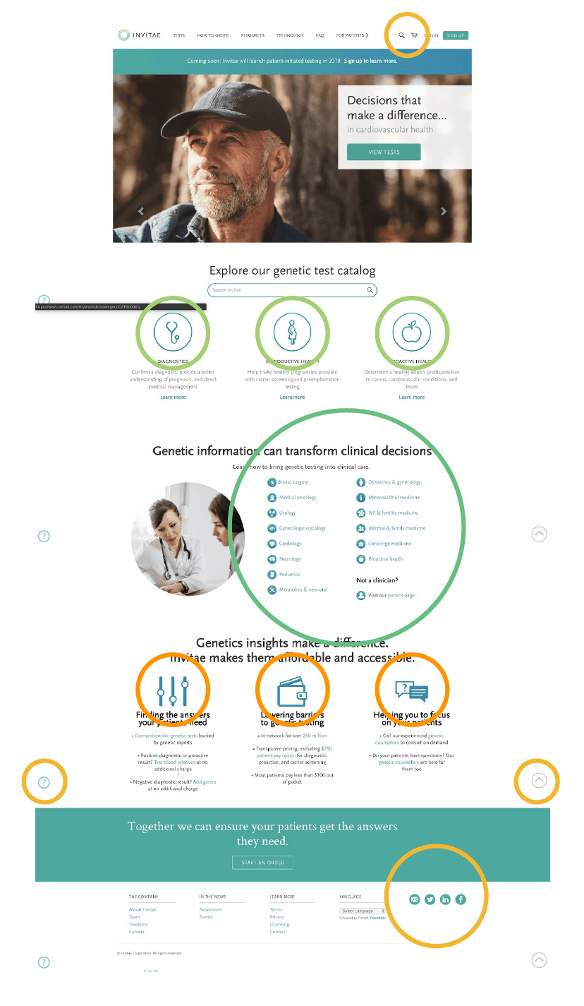
Conducted a thorough audit of both the consumer website and physician portal to document all existing icon usage.Collaboration
Partnered with the Marketing team to identify a comprehensive list of icons needed for both marketing and general use.Define Style
Established a clean, simple stroke style for the icons to reflect the company’s branding.Design & Feedback
Created the icon suite and reviewed it with the design team, incorporating feedback and making necessary adjustments.Versioning
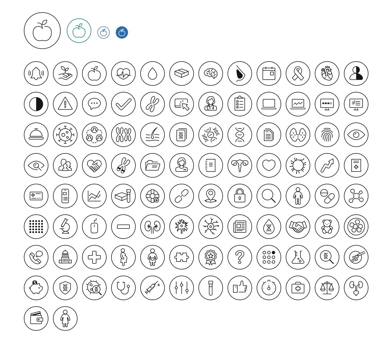
Developed four versions of each icon, designed to be used in black and in the company’s primary brand colors.Development Handoff
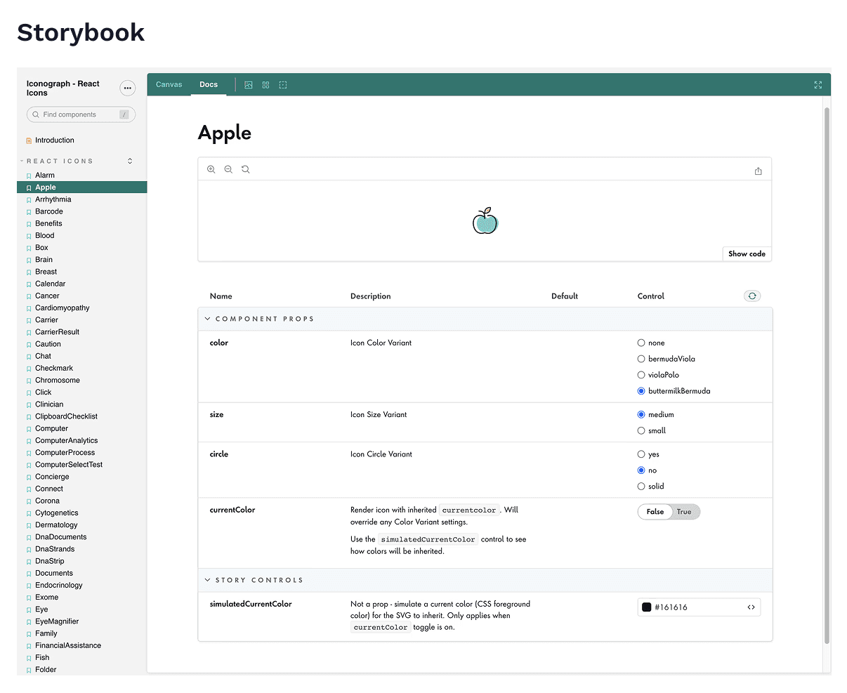
Collaborated with a lead developer to prepare icon files for upload to Storybook and to package them on GitHub, ensuring easy access and implementation for other teams.
Learnings & Iterations
While the initial launch of the first version of icons gave Invitae’s website and portal a clean, cohesive look, we quickly noticed that the use of a single color made some pages feel too plain, especially on the consumer-facing site. To address this, I created a new version of the icons—what I called the “splash of color” set—using three different two-color combinations. The idea was to reserve these more vibrant icons for consumer-facing content, while keeping the single-color icons for the portal, where clarity and function were more important than visual flair.
Another unexpected win came from collaborating with the lead developer, who built a custom Figma plugin to automate the creation of splash icon variants. This significantly streamlined the process and saved me from having to manually create each color variation one by one.
Impact
After four months of design and development, the new icon library was fully adopted across multiple teams. It significantly improved visual consistency and gave both the website and portal a more polished, professional appearance. With a centralized, easy-to-use library, both design and development teams were able to work more efficiently—spending less time on asset creation and more time focusing on other areas of their projects.